Data visualization is the process of translating processed and organized data into a graphical format so as to facilitate the identification of patterns, relationships, and trends. In Python, this is done through data visualization libraries that analyze numbers and data organized in tables.
Did you know that, according to Linearity by 2027, 3D data visualization is expected to dominate over 2D visualization by a high margin of 60%?
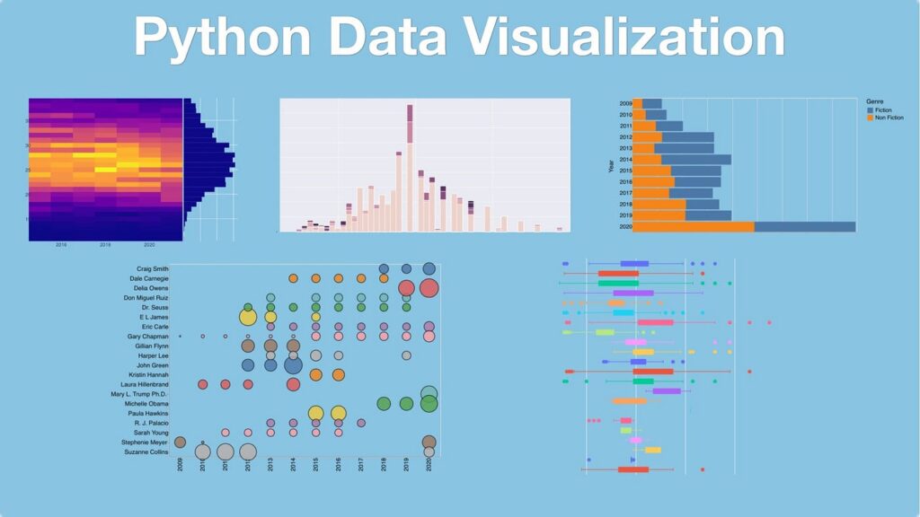
Aside from quantitative analysis, Data visualization is possible through Matplotlib, the most fundamental and widely accepted library in data visualization in Python.
Why Should You Use Matplotlib?
Matplotlib’s technical control and depth, not the emergence of newer libraries, is the cause of Matplotlib maintaining its relevance over the years.
Main advantages are:
• Seamless integration with NumPy for numerical computations
• Customization of axes, labels, ticks, legends, and layout
• Multiple plots in a single figure
• Publication quality export
For maximum precision, reproducibility, and customization, the flexibility that Matplotlib in Python offers is unmatched.
Matplotlib’s Core Architecture
To use Matplotlib effectively, it is helpful to understand its internal structure.
Matplotlib has a layered architecture:
• Figure: This is the outermost layer and represents the entire visualization.
• Axes: This is the inner layer that represents the actual plotting area inside a figure.
• Axis: The x and y axes that control the scale and limits.
This structure allows the developer to manipulate multiple plots, layouts, and styles, which is important for data visualization at a professional level.
Matplotlib and NumPy Integration
NumPy is the computational backbone of Matplotlib.
Why is NumPy important?
Matplotlib can directly use NumPy arrays. Mathematical computations are vectorized and optimized. Large data sets can be plotted without running into performance issues.
Example use cases of Matplotlib and NumPy:
• Mathematical functions plotting
• Statistical distribution visualization
• Time-series data from numerical simulations visualization
Without NumPy, Matplotlib is severely handicapped in terms of analytical capability.
Variety of Common Plots in Matplotlib
Matplotlib offers a wide range of plot types for analytical purposes.
1. Line Plots
Used for: Time-series analysis, Trend analysis and Visualization of continuous data
Best practices: Label axes, Use consistent scales and to Avoid spatial redundancies
2. Bar Charts
Used for: Comparison across categories, Visualization of the distribution of frequencies, Performance metrics and Comparison of discrete values across categories
3. Scatter Plots
Used for: Analysis of relationships, Analysis of correlation and Analysis of outliers and Often combined with statistical overlays for deeper insight.
4. Histograms
Used for: Analysis of distribution, Visualization of frequency, Sharing data and Critical in exploratory data analysis and statistical modeling.
Customization and Styling in Matplotlib
Customization is one of the greatest advantages of Matplotlib.
Customization areas include:
• Axis limits and scales
• Gridlines and tick labels
• Style of the legend and annotations
• Size and resolution of the figure
Applications:
• Technical reports
• Research papers
• Business dashboards
Greater control over visualizations aids the developer and enhances precision in the visualizations.
Best Practices for Effective Data Visualization
- Match the type of plot with the data structure to facilitate the most effective visualization.
• Avoid the overuse of colors and markers.
• Use titles and labels to describe the visuals.
• Use consistent styles.
In a good visualization, the absence of good design can lead to a lot of misunderstandings, whereas the use of good design can lead to the right insights.
Real World Use Cases for Matplotlib
Use cases for Matplotlib are broad:
• Development of machine learning and data science
• Scientific and research simulation
• Financial trend forecasting
• Engineering and performance analysis
Its huge breadth of application allows usage for both exploratory analysis and formal reporting.
Read on: How to Build a Data & Analytics Strategy that Drives Business Value in 2026?
Wrap Up
The amount of complex data we are faced with increases each and every day. Data visualization with Matplotlib enables us to bridge the gap between raw information and informed decision-making. When working with data, the ability to identify information and communicate it is invaluable. Mitigating overwhelming complexity with purposeful visualization is invaluable.
Frequently Asked Questions
Can Matplotlib handle big data sets?
Yes, particularly when paired with NumPy and Matplotlib, large quantities of numerical data can be managed with ease.
What are the differences between Seaborn and Matplotlib?
Matplotlib operates on a low level, and Seaborn operates on a Matplotlib level with a higher degree of statistical visualization.
Can machine learning visualization use Matplotlib?
Yes, it is often used to summarize and visualize the performance of Machine Learning models, loss graphs, and distributions of predictions.
Why is learning Matplotlib necessary if there are other libraries for data visualization?
Yes, they do, and it tends to be reliant on Matplotlib as the principal rendering engine.