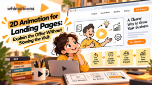
A visitor clicks an ad expecting a simple answer, but the landing page opens with an unfamiliar product and a wall of features. A moving illustration might clarify the offer—or become another obstacle between the visitor and the next step. That tension makes 2d animation for landing pages a design decision, not merely a video purchase. The most useful animation gives people a clearer understanding of a process, service, or outcome while respecting their time, device, and ability to navigate the page. Getting it right means planning the message and the web experience together.
Identify the Question Your Page Cannot Answer Quickly
Before commissioning animation, read the landing page as someone seeing the offer for the first time. Can they tell what is being offered, who it serves, and what to do next without pressing play?
If the answer is no, repair the headline and supporting copy first. Animation should clarify a difficult relationship, not compensate for vague messaging.
Look for a question that is genuinely easier to show: how information travels between systems, what changes during a service, or why two similar options produce different experiences. Those are stronger subjects than a narrated list of benefits already printed on the page.
Where 2D Animation for Landing Pages Earns Its Space
Placement should follow the visitor’s decision, not a rule that every video belongs at the top. A short explainer near the hero section can help when the product’s mechanism is unfamiliar. On a page selling a straightforward appointment, a static explanation and visible booking button may be more effective.
Another option is placing the video after a brief problem statement. Visitors first recognize their situation, then choose whether to explore the solution visually.
Keep the main call to action accessible without requiring anyone to watch. The animation is an optional path to understanding, not a gate between the visitor and the form.
Build a Story Around One Useful Change
Imagine a neighborhood tool-rental service offering contractors a way to reserve equipment before arriving at the counter. Its landing page already lists availability, pickup hours, and rental categories, but visitors remain uncertain about the reservation sequence.
An animation could show a contractor choosing a tool, selecting a pickup window, and receiving a reservation confirmation. A final scene would distinguish reservation from payment if the business collects payment at pickup. That distinction matters more than decorative scenes of construction equipment.
The storyboard should answer one question: what will happen after I take the page’s main action? If the service has exceptions, such as inventory confirmation, the script should describe them accurately rather than promise an instant outcome the system cannot guarantee.
Match the Visual Style to the Explanation
Character animation can illustrate a customer’s problem and response. Flat motion graphics are often better for steps, comparisons, or abstract systems. A short interface-inspired sequence can explain a digital workflow, provided it does not misrepresent the actual product.
Teams requesting 2d video animation services should share the landing page’s headline, audience, and intended conversion action before choosing a style. Website Digitals can be considered in this combined design-and-animation context, where page layout and moving visuals need to support the same message.
A common mistake is adding captions, labels, and voice-over that all repeat the same sentence. Let narration explain context while the image shows relationships. Keep on-screen text brief enough to read on a phone.
Protect the Page’s Loading and Interaction Experience
A beautiful explainer offers little value if its player delays the content people came to see. Use a well-compressed poster image, reserve space for the player so the layout does not jump, and avoid loading a large video before it is needed.
Below-the-fold videos can often wait until the visitor approaches them. For prominent video near the top, test the actual loading behavior rather than assuming that every lazy-loading technique is appropriate.
When planning 2d animation for landing pages, decide whether the concept needs a full narrated video at all. A lightweight illustration, static diagram, or small motion sequence may communicate a single interaction more efficiently.
Website Digitals can evaluate the video alongside page performance, responsive layout, and accessibility considerations rather than treating delivery of an MP4 as the end of the project.
Make the Experience Work Without Sound or Motion
People may arrive in quiet workplaces, use assistive technology, or prefer not to watch moving content. Offer accurate captions for spoken information and a nearby written summary that communicates the essential point.
Provide visible playback controls and avoid unexpected audio. If an animation moves automatically, consider whether visitors need a way to pause or stop it. Respect reduced-motion preferences where applicable, particularly for decorative movement.
Check that meaning is not conveyed by color alone. A red and green comparison, for example, also needs labels or another distinction. Most importantly, users should be able to complete the page’s primary action without viewing the animation.
Connect the Final Scene to the Actual Call to Action
An animation that ends with “Learn more” while the page asks visitors to “Reserve equipment” creates an unnecessary decision. Align the last scene with the page’s next step and avoid introducing a second offer.
For 2d animation for landing pages, the ending should resolve the uncertainty raised at the beginning. If the viewer now understands the reservation process, the next action can be stated plainly without an elaborate sales pitch.
Also plan for updates. Pricing, interface details, and service conditions may change. Keeping volatile information outside the video—or in easily editable scenes—can prevent an otherwise useful asset from becoming inaccurate.
Test Understanding Before Celebrating Play Counts
Video views alone do not tell you whether the page communicates better. Compare the visitor’s ability to explain the offer, the visibility of the primary button, and completion of the intended action.
A practical prelaunch review can ask:
- Can someone understand the offer without watching?
- Does the video answer a question the copy leaves open?
- Is the text readable and the player usable on a small screen?
- Does the page remain responsive before and after playback?
- Are the final scene and page button asking for the same action?
When comparing 2d video animation services, include revisions for mobile readability and page integration in the brief, not only illustration and voice-over quality.
Let Clarity Decide Whether Animation Belongs
The strongest 2d animation for landing pages is not necessarily the longest or most elaborate. It is the version that removes a meaningful point of confusion while allowing visitors to move forward at their own pace. Sometimes that calls for a short character story; sometimes a diagram and a sentence will do the job better.
Website Digitals is one possible digital-services partner to assess against these practical requirements, but the evaluation should start with the visitor’s needs rather than a production format. Before investing in a video, write down the one question it must answer, check whether existing page content already answers it, and define how you will judge the result. The goal is a clearer decision for the visitor, not simply more motion on the screen.