Real Estate Branding Isn’t Casual — It’s Trust First
Real estate is one of those industries where perception matters immediately. People are dealing with money, property, long-term decisions… they’re not going to trust a brand that feels off.
That’s why when someone searches logo design for real estate, they’re not just looking for something “nice.” They want something that feels stable. Reliable. Professional.
And honestly, that’s where AI design starts to struggle.
Because real estate branding isn’t just about visuals. It’s about trust signals. Subtle ones.
AI Can Generate a Logo… But Not Credibility
You can get a logo from AI in seconds. Clean icon, decent font, maybe even a nice color combination.
But look a bit closer.
Most AI-generated real estate logos feel… generic. You’ll see the same roof icons, building shapes, abstract symbols. Nothing wrong with them individually, but they don’t say anything specific about your business.
That’s the issue.
Real estate isn’t a place where “good enough” works. If your branding feels like everyone else, you blend in. And blending in is not what you want in a competitive market.
Professional designers approach this differently. They don’t just generate options. They think about positioning. Who you’re targeting. What kind of properties you deal with.
That’s something AI doesn’t really understand.
Wrong Color Psychology Can Hurt More Than You Think
Color plays a big role in real estate branding. Maybe more than people expect.
Blue is often used because it builds trust. Black can feel premium. Green can signal growth or stability.
AI tools don’t always get this right.
You might end up with colors that look attractive on screen but don’t match the industry expectation. Bright, playful tones where something more grounded is needed. Or combinations that clash when applied across platforms.
It’s subtle, but it affects perception.
Professional designers don’t just pick colors. They choose them based on context. Audience. Market positioning.
That difference shows over time.
Typography Mistakes That Break the Brand
Fonts matter more in real estate than people realize.
You’re often dealing with names — personal brands, agency names, property groups. Typography becomes the core of the logo.
AI tends to mix styles without thinking. Poor font pairing is common. A modern font with a traditional icon, or vice versa. It creates confusion.
And spacing… that’s another issue. Slight imbalance, and the whole logo feels unpolished.
A strong real estate logo usually keeps typography clean, readable, and aligned with the brand tone. Not flashy. Not experimental.
Just solid.
No Brand Strategy = No Direction
This is the biggest gap. AI doesn’t ask questions. It doesn’t understand your market. Are you targeting luxury clients? First-time buyers? Commercial investors? Each of these requires a different visual approach.
Without that context, you get random results. Designs that might look fine, but don’t connect with your audience. That’s why working with a logo design agency changes things. There’s a process behind it. Discovery, research, direction. Not just output.
Scaling Problems Show Up Later
At first, everything looks okay. Then you start using the logo.
On a website — fine.
On a business card — still okay.
On a billboard or signage — problems start.
AI-generated logos often come in formats that don’t scale well. Details get lost. Edges blur. The design doesn’t hold up. Real estate businesses rely heavily on physical branding boards, hoardings, print ads.
If your logo doesn’t scale properly, it becomes a real issue. Professional designers work with vector files from the start. That’s what keeps everything sharp, no matter the size.
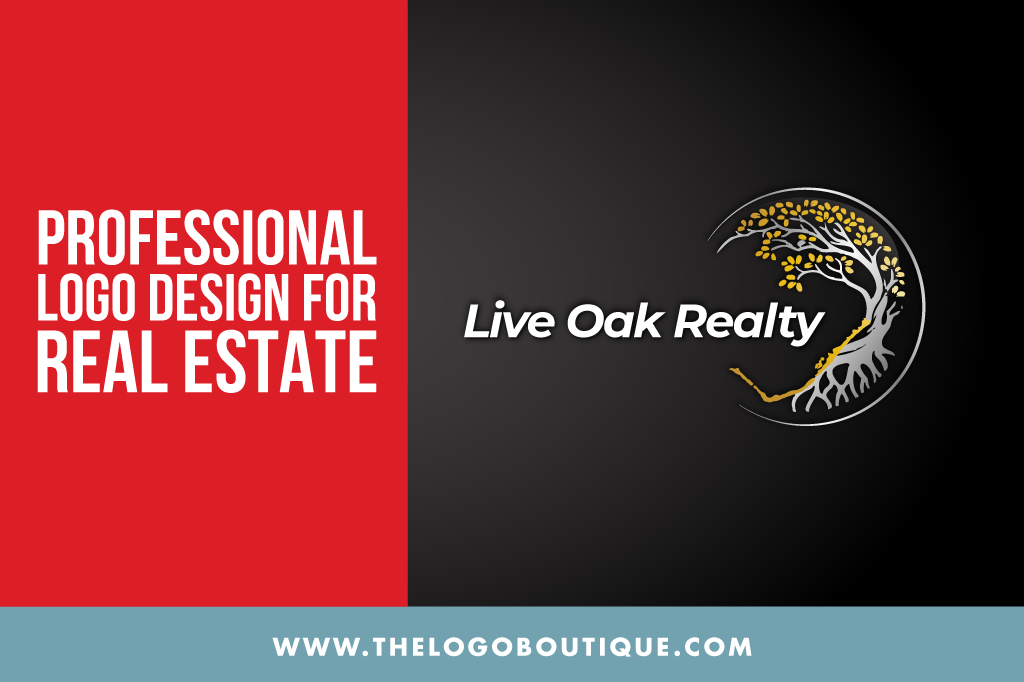
Generic Icons and Overused Concepts
Let’s talk about the obvious one. Roofs. Buildings. Keys. These show up everywhere in AI-generated logos. Because that’s what the data is trained on. The result? Everything starts to look the same. Now, using a roof icon isn’t always wrong. But when it’s done without thought, it loses impact. Professional designers either refine these ideas or move beyond them. They look for ways to make the brand distinct, even within a familiar theme.
That’s the difference between a logo that blends in and one that stands out.
Why Professional Design Still Wins Here
Real estate branding needs consistency. Across platforms, across materials, across time. That’s hard to achieve without a proper system. A logo design agency doesn’t just give you a logo. They provide variations, formats, usage guidelines. Everything needed to maintain consistency.
AI doesn’t do that. It gives you a file. Maybe a few variations. But no structure behind it. And without structure, things start to drift.
Where Boutique-Style Thinking Comes In
This is where a more refined approach makes sense.
Instead of mass-produced designs, a boutique-style process focuses on detail. Alignment. Subtlety.
Even in real estate, this matters.
A carefully crafted logo feels more intentional. More premium. It communicates stability without trying too hard.
That’s something AI hasn’t quite figured out yet.
Why This Matters for Growing Businesses
If you’re just starting out, it might be tempting to go the quick route. Save time, save money.
But real estate isn’t forgiving when it comes to branding.
Clients are making big decisions. They look for signals. Anything that feels off can create doubt.
A weak logo won’t destroy your business. But it can slow you down.
And fixing it later? Always more complicated.
Final Thoughts (Keep It Real)
AI design tools are improving. No doubt about that. But when it comes to logo design for real estate, they still miss the mark on the things that matter most strategy, consistency, real-world usability.
You can get something that looks decent. But decent isn’t always enough. If you want a brand that builds trust, holds up across platforms, and actually represents your business properly, you need more than quick output.
You need thinking behind it. And that’s where professional design still wins.