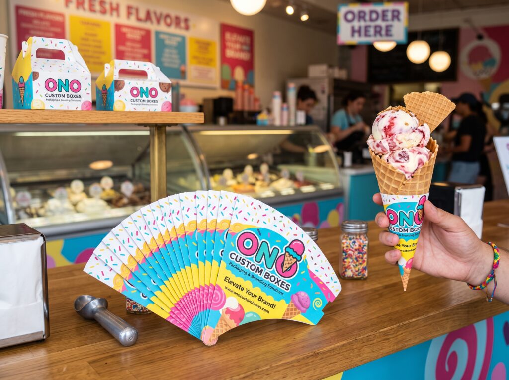
The most effective cone sleeve designs use one dominant color, place the logo in the upper third above the grip zone, keep type large enough to read at three feet, and include a single call to action such as a social handle. Simplicity beats density on a surface this small.
A cone sleeve gives you roughly 3 by 5 inches of curved, partially obscured, frequently sticky real estate. It is one of the hardest canvases in packaging design, and one of the most rewarding when it works.
Done well, branded ice cream cone sleeves turn a functional grip into a portable identity piece. Done badly, they become a smudge of tiny text that nobody reads. The difference comes down to a handful of decisions.
Understand the Grip Zone First
Before any creative work begins, map how the sleeve is held.
A customer wraps their hand around the lower half to middle of the sleeve. That area is covered for the entire time the product exists. Anything printed there is functionally invisible.
This single fact should drive your layout:
- Upper third: logo, brand name, primary mark. Always visible.
- Middle band: secondary elements, pattern, tagline. Partly visible.
- Lower third: decorative texture only. Assume it will never be seen.
Most amateur designs center the logo. Centered means gripped. Move it up.
One Color Does More Than Five
Color psychology in food packaging is well trodden ground, but the practical lesson for a small format is about contrast, not theory.
Pick a single saturated background color and reverse your type out in white or a very light neutral. This produces the highest visual contrast and the greatest legibility at distance. A person across the street should be able to identify your brand from the sleeve alone.
Multi-color gradients and photographic backgrounds fail here for two reasons. They reduce contrast with any type placed on them, and they reproduce inconsistently across print runs and stocks.
If your brand palette has several colors, use one as the sleeve background and the others as accents on interior elements or seasonal variants.
Type That Survives the Distance Test
Here is a quick check that catches most problems. Print your design at actual size, tape it to a wall, and walk back ten feet.
What can you still read? That is your real message. Everything else is decoration.
Practical typography rules for this format:
| Element | Recommended Treatment |
|---|---|
| Brand name | Largest element, upper third, high contrast |
| Social handle | Second largest, short form only |
| Tagline | Optional, five words maximum |
| Website | Only if short and memorable |
| Phone number | Usually omit — nobody calls from a sleeve |
| Address | Omit unless you are in a tourist district |
The temptation to include everything is strong. Resist it. A sleeve with three legible elements outperforms one with nine illegible ones.
Design for the Photograph
Ice cream is photographed constantly. Cones get held up against skies, walls, and murals. This is free distribution, and you can design for it.
Consider the frame. Your sleeve will often appear at a slight angle, held up, with the cone above it. The visible portion in that pose is the upper band. Load it accordingly.
Add a caption prompt. A short hashtag or phrase gives customers something to type. It costs nothing on the print run.
Make it seasonally collectible. Rotating designs give regulars a reason to photograph the same product again. Four seasonal variants across a year can produce noticeably more user-generated content than one static design.
Test against real backgrounds. A pale mint sleeve disappears against a summer sky. A deep coral pops. Mock your design against the environments where your customers actually stand.
Material Choices Shape Perception
Stock is part of the design, not a separate procurement decision.
Uncoated kraft reads artisanal and handmade. It suits small-batch and farm-to-cone positioning. Colors print muted, so design with that in mind rather than fighting it.
Bright white uncoated gives clean, modern color reproduction. It is the safest choice for bold graphic identities.
Matte finish feels considered and premium. Gloss feels mass-market and can complicate recyclability claims.
Board weight matters too. Flimsy stock undermines a premium design instantly. Most operators land between 14 pt and 18 pt for a sleeve that feels substantial without adding meaningful cost.
Getting It Printed Right
Two production notes save a lot of grief.
Always approve a physical proof. Screen color and printed color differ, especially on kraft stock. A digital proof on your monitor tells you very little about how a warm brown board will shift your brand blue.
Ask about print method. Digital printing suits shorter runs and seasonal variants with lower setup costs. Offset becomes more economical at higher volumes and gives tighter color control. Many custom packaging suppliers, including printers like ONO Custom Boxes, quote both so you can compare against your actual order size.
Build your artwork with proper bleed and keep critical elements away from fold and die lines. A logo that gets cut by a crease is a preventable mistake.
A Simple Design Checklist
Before you send files to print:
- Logo sits in the upper third, above the grip zone
- One dominant background color with high-contrast type
- Design passes the ten-foot legibility test
- Three or fewer text elements total
- Single clear call to action
- Artwork tested against realistic photo backgrounds
- Physical proof requested and approved
- Bleed and safe zones correct for the die line
Frequently Asked Questions
How much space do I really have?
Roughly half your printed area stays visible in use. Plan the layout around the upper portion.
Should I match my cup and sleeve designs exactly?
Coordinate rather than duplicate. Shared color and type family with different layouts reads as a considered system.
Do seasonal designs cost more?
With digital printing the setup difference is modest. Shorter runs cost slightly more per unit but often earn it back in renewed customer interest.
Is kraft or white stock better?
Kraft suits earthy, artisanal brands. White suits bold, graphic, modern ones. Neither is universally better.